I haven't done a freelance-artist project postmortem since the Veranthea Codex, back in early 2015, but I keep meaning to, and the Book of Exalted Darkness (BoED) is the perfect opportunity. Like the Veranthea Codex (VC), the BoED is the brainchild of Mike Myler (most recently of Operation: NaziSmasher fame), and is best described as a sprawling decopunk campaign setting for D&D 5th Edition, catering to super evil (and/or, since the stretch goals were reached, super good) characters. "Decopunk" was a term he introduced me to for this project - an alternate-history concept like steam- or diesel-punk with heavy art deco visual themes. I love art deco. I was immediately jazzed about the project. Mike wanted to keep the art concise and consistent, and so chose me as the featured artist for the book, for which I remain deeply honored.
As with VC, I'm not going to share all of the pieces in their entirety - you'll have to pick up the book! In the VC postmortem, I included portions of all 16 pieces I completed for the pantheon. For BoED, I completed 38 pieces, including the cover, so I'm only going to highlight the ones on which I grew the most. Every project has lessons, and this one had quite a few!
I've maintained my "assembly line" mentioned in the earlier postmortem, but have added one stage, lineart. On large projects, I commonly have at least four items to progress/finish for the day, all at various stages: preliminary (loose) sketch, lineart (this stage was added for the Book of Passion, an adult OGL 3.5 project by Misfit Studios, because each piece was to be possibly printed in b/w and color - it seemed to add value to be a feedback stage on other projects, so I've kept it), flat colors, and final painting. Each stage gets sent off for approval/changes, so I might be working on 10 or more separate pieces in the span of a week. It took a while to get used to not hyperfocusing on one piece start-to-finish, but it's made for a faster turnaround on my end and a more consistent feel across pieces for the project. Win-win!
The Promo Pieces

Art brief asked for two large cover pieces, one with a celestial paladin, and one with an evil character, in something that set the highly-chromed, decopunk tone for the project. These two pieces were created for the Kickstarter, and represent an extreme version of the interior art - it just was too wildly different from my normal style for me to complete that many pieces quickly enough. Not only that, but I relied on a chroming filter laid on top of colors for the metal in these, and while it's not a bad look, I decided I wanted to learn how to handpaint shiny metals. I'd be doing it in every piece, so there was no reason not to use that to get good at it. I do love these pieces, enough to offer them at my convention tables as prints. The light side is my favorite of the two, though popular opinion seems to disagree, as I sell twice the amount of dark side posters.
Stefany Hibernica (portion)

Hijacking a Steel Equos (portion)

Rankir Tarryndorn (portion)

Tapper, Gnome Ranger
I'm sharing this one in its entirety. Art brief asked for a gnome who also happened to be the best ranger in the world, but heavily decorated (as with all of these "Celestial" characters).

Everything came together on him. I found a mix I was happy with between textured, painterly areas and round brush reflections, I love the color palette, and I'm not sure I ever got a more realistic shine during this project than the chromed gold on his outfit. The cutouts and shapes are art deco without being in your face about it. He's properly proportioned as a gnome (or very short man), but still looks like an adult. If I had to pick a favorite piece out of this project, it might be Tapper. There is very little I would change.
Varrus Goodwin (portion)

Caskette (portion)

Caskette's art brief was a fun challenge - essentially it asked for a super goth, power-suited woman reminiscent of an emo Ironman. Yes, please. I had to figure out how to paint shiny black metal, and once we settled on the sickly greenish glow for her power sources, the bright indigo jumped out at me as the perfect midtone. I noticed myself gravitating to very different color palettes than my usual for this project - bright, but at the same time, a little more natural (maybe not so much in this piece). I still love glowy things though. I hope that never changes.
Agens Coenobita (portion)
 Art brief asked for a monk with bladed gloves, like the ones Shredder wore in TMNT. It was a lower tier piece, so it didn't get quite as many hours of work as some of the Celestials did, but I love how the blades turned out. I started using those white dots in the open midtones of some of the pieces, I'm not sure why, but I liked how it looked.
Bands of Kyttarmoak (portion)

This slice represents about 1/6th of the piece. This piece. Man, this was a hard one from the get-go. A full scene, with TWELVE metal "portals," each a unique art deco-inspired design, floating in air, each leading to a different hellish scene. This was a beast. Thankfully, he had various stock pieces already lined up to use for the hellish scenes (although a few of mine are visible here, the nightmare gods from VC and Invasion!, my War of the Worlds-inspired piece), but designing 12 individual portals and figuring out how to compose the scene as a whole was, well, a challenge is an understatement. There was a lot going on in this one. I especially like the "phases of the moon" frame, I would dig that as a mirror or clock frame on a wall. Overall, there are always some pieces where the things that must be displayed to augment the story make for a challenging or busy composition - one of the differences between illustrating for clients and doing personal work. Composition is still important, and I always try to make sure it's as aesthetically pleasing as possible, but ultimately they need certain things shown and it's an artist's job to show them. A tricky balance!
Grafting Feat (portion)

A noblewoman having had a few odd items grafted on to her, hellish wings and a demon's arm. This one was another lower-tier piece, so it didn't get quite as much painting time, but I'm not sure it really needed it in the end. Included here because it's a great example of how much my palette has shifted over time, plus I like the light, soft round texturing on the grafted demon arm skin, and I'm very happy with the turquoise work. I did a series of amulets as stock art for my Patrons (please support my art, and get awesome stuff in return! www.patreon.com/tortoiseharecreations ), but turquoise is one gemstone I didn't get to practice in that project. I wanted to tackle it here as soon as I put her in peach and realized how warm the piece would be - I figured a nice, cool turquoise would be a perfect little pop of color.
Purpura (portion)

This is a much larger scene than this little slice, and this is one of the least gruesome sections to boot. You can't have a setting for extremely evil characters without an extremely evil scene or two, right? The art brief asked for a torture room for "purpura," who are good, purple-skinned, beret-wearing smurf-like magic creatures. It didn't specify any forms of torture, but asked me to get creative. If you pick up the book (which you should!), definitely seek out this piece.
Rakshasa Transformation
Art brief asked for someone transforming into a Rakshasa, painfully. Sharing this one in its entirety as well, it's a solid second-place for me behind Tapper. I augmented my standard fur-painting here and was really pleased with the natural coloration, and liked the overall design of the piece. I figured a human would have to grow a tail (ouch), so I painted the tail forming from the inside out - first bone, then muscle, then fur. The armor is simple, but I'm okay with that as it's not the focus of the piece. Originally, she was a full body piece like the others in the project, but he recommended we focus in on the action, and I think it was the right call.
Sanguine Razorstorm (portion)
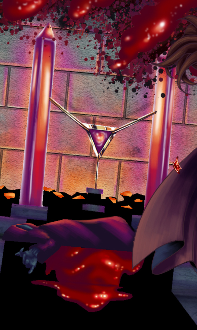
This is a really small slice of this piece and is mostly the background, but I really loved the color work, and the velvetiness of the blood. I use a LOT more colors than I used to.
Knight of the Slate (portion)

One of the many pieces I didn't share was the Grey Knight, a monotone all-chromed-silver full-plate paladin with a full mask. This guy is a rogue one of those, so his costume design is very similar, except his scarred face is visible and he has power gauntlets and boots. I like him a lot - that deep purple color, the shiny metal, the coils, the scaled under armor, the not-quite-right-in-the-head expression. I just really like this guy.
Oktellio (portion)

It is absolutely hard to tell what's going on here, as it's a small portion of the character, but I'm sharing it for the work on the tentacles. I know what that would feel like if I touched it, which is all I ever want from a painting.
Treklotus Edwardius (Portion)

I didn't share the other, Celestial tiefling, but this guy was the final piece I finished for the project, and while I like both tieflings, I like the gold work on Treklotus a bit better. The other tiefling, Darius, is a much lighter reddish-orange, but the client requested this guy be much darker, and more purple-red based.
The Cover

Mike wanted to reference the old Book of Vile Darkness manual in the cover composition for the Book of Exalted Darkness, so we chose to place the Mpahy Tantara - a book so vile it requires multiple protections to keep it closed - slightly tilted on an inscribed wooden table. Much of what I learned during the project as a whole made it into the cover - heavy chrome, chainwork (I didn't share a scene that features innumerable chains, all of which were hand painted, but check the Peirant Parhaol illustration in the book!), texturing, glow, etc. A few of my favorite things. Added the frame to the outside to tie back to the promo posters, and we've come full circle. I know this was long, so thank you for sticking it out! There's so many more pieces I didn't have the space to touch on here, but I highly recommend checking out the Book itself. Also, if you enjoyed this peek behind the scenes at life as a freelance artist, consider joining my Patreon and seeing far more! www.patreon.com/tortoiseharecreations
Get the Book of Exalted Darkness HERE!


No comments:
Post a Comment